Flip card
Configuration
Configuration file specificity
In the config.json file, the template name is flip-card.
{
  "template": "flip-card",
  "templateParams": {
    "rectoCardLogo": "assets/recto.webp",
    "versoCardLogo": "assets/verso.webp",
    "cardGradientColor1": "rgba(191,30,104,1)",
    "cardGradientColor2": "rgba(238,34,56,1)",
    "cardHeadColor": "white"
  },
  [...]
}
Click on the card to see the configuration details
Flip card
Configuration
Params can be set :
rectoCardLogopath to the recto footer image. default: none.versoCardLogopath to the verso footer image. Can be same asrectoCardLogo. default: none.cardGradientColor1first color of the recto head gradient square. default: red as this card.cardGradientColor2second color of the recto head gradient square. default: red as this card.cardHeadColorcolor of head square text, must contrast withcardGradientColor. default: white.
Flip card
Usage
Markdown specific tags to use with this template

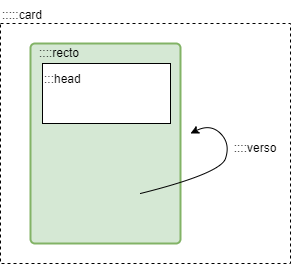
Flip card template use some custom markdown tag as card, recto, verso and head to allow you to control how to place your content.
Click on the card to see example
Flip card
Usage
::::: card
:::: recto
::: head
__Context sentence__
# Title of the card
> Quote sentence
:::

The front content
[...]
::::
:::: verso
The back content
[...]
::: img small|medium|large

:::
::::
:::::
Flip card
Export cards
PDF / Print export is available on this template
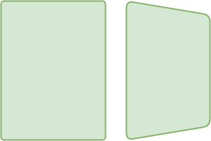
Flip card can be exported in PDF or print. Just use print function of your browser.
This will generate A5 sized card (front and back side by side). So export it as A5 support of A4 portrait.
Flip card
